Best Paint Colours for Small Canadian Homes: A Room-by-Room Guide | Georgia Home Design
The right paint colour can make a small Canadian home feel twice its size. Here are the best picks for every room, tested in real Canadian light.
Georgia
Best Paint Colours for Small Canadian Homes: A Room-by-Room Guide
Best Paint Colours for Small Canadian Homes
Small homes are the norm across much of Canada. Whether you own a 900 sq ft wartime bungalow in Winnipeg, a compact condo in Calgary, or a narrow row house in Toronto, paint colour is the single most affordable tool you have to change how your space feels.
But here’s the catch: paint advice written for sun-drenched California homes doesn’t work in Canada. Our light is different. Our winters are longer and greyer. The colours that expand a small room in Phoenix can make a small room in Manitoba feel like a cave from November to March.
I’ve painted out hundreds of swatches in Canadian homes across every season. These are the colours that consistently work in compact spaces under our unique light conditions.
Why Small Canadian Homes Need a Different Approach
Two factors make Canadian paint selection tricky:
Low-angle winter light. From October to March, sunlight enters at a steep angle and carries a blue-cool tone. Colours with cool undertones (blue-grey, cool white, lavender) get amplified and can feel icy. Colours with warm undertones hold up better across seasons.
Short daylight hours. In December, Winnipeg gets about 8 hours of daylight. Your rooms spend more time under artificial light than natural light. If your paint looks great at noon but washes out under your evening lamps, that’s a problem for most of your waking hours.
The best paint colours for small Canadian homes work under both natural winter light and warm artificial light, and they make the walls feel like they’re pushing outward rather than closing in.
The Best Colours Room by Room
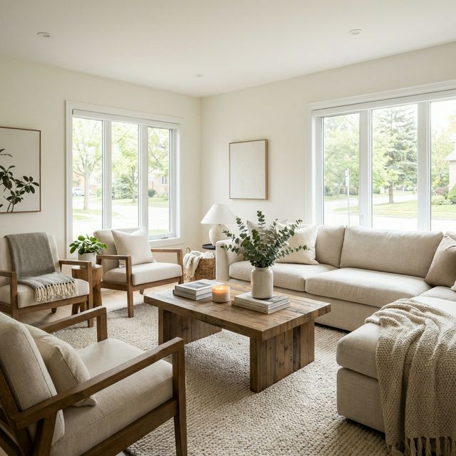
Living Room: Warm White
The living room is where paint matters most in a small home. It’s usually the largest room, the most visible, and the one guests see first.
Top pick: Benjamin Moore Simply White (OC-117)
Simply White has a barely-there warm undertone that prevents it from going cold in winter. It reflects light without feeling stark, and it works with virtually every furniture style and accent colour. In a small living room, it makes the ceiling feel higher and the walls feel further apart.
Benjamin Moore Simply White Sample — always test a sample pot before committing.
Runner-up: Sherwin-Williams Alabaster (SW 7008)
Slightly creamier than Simply White. If your living room gets minimal natural light, Alabaster’s warmer tone compensates without reading as yellow.
For more on choosing the right palette, see our colour palette selection guide.
Kitchen: Soft Greige
Kitchens in small homes do triple duty — cooking, eating, socializing. The paint needs to handle steam, grease splatter proximity, and look clean without showing every fingerprint.
Top pick: Sherwin-Williams Agreeable Gray (SW 7029)
The definitive greige. It’s the most popular paint colour in North America for a reason: it reads as warm grey in cool light and warm beige in warm light. In a small kitchen, it’s sophisticated without being dark, and it pairs beautifully with white cabinetry, butcher block, and stainless steel.
Runner-up: Benjamin Moore Revere Pewter (HC-172)
A touch warmer and more beige-leaning than Agreeable Gray. Excellent in north-facing kitchens where cool light dominates.
Use a satin or semi-gloss finish in the kitchen — it’s easier to wipe clean and reflects more light, which helps in tight spaces.
Bedroom: Warm Neutrals with Depth
Bedrooms can handle slightly deeper colours than living areas because you’re not trying to make them feel expansive — you want them to feel cocooning and restful.
Top pick: Benjamin Moore Edgecomb Gray (HC-173)
A warm greige with enough depth to feel intentional but light enough to keep a small bedroom from feeling closed in. Under lamplight, it glows. Under winter daylight, it stays warm.
Bold alternative: Benjamin Moore Hale Navy (HC-154) on one wall
A single accent wall in deep navy creates perceived depth — the dark wall appears to recede, making the room feel longer. Pair with warm white on the remaining walls and warm brass hardware. This works particularly well in bedrooms that face east or south, where morning and midday light prevent the navy from feeling oppressive.
Bathroom: Bright and Clean
Small bathrooms are the trickiest rooms to paint. Limited natural light, high moisture, and typically no more than 40–50 sq ft of floor space.
Top pick: Benjamin Moore Chantilly Lace (OC-65)
The brightest true white in Benjamin Moore’s lineup. In a small bathroom, maximum brightness is the goal. Pair with warm-toned fixtures (brass or gold faucets, warm wood vanity) to prevent the space from feeling clinical.
For more character: Farrow & Ball Pigeon (No. 25)
A sophisticated grey-green that gives a small bathroom personality without shrinking it visually. Works best with good artificial lighting (2700K vanity lights on both sides of the mirror, not just overhead).
A good quality bathroom paint in semi-gloss makes a real difference for moisture resistance. Zinsser Mold Killing Primer is worth applying first in any bathroom with moisture concerns.
Hallways and Entryways: Flow and Continuity
In small homes, hallways connect everything visually. Using the same colour as your main living area creates flow and prevents the home from feeling chopped up into tiny boxes.
Best approach: Match your living room colour, or go one shade lighter. If your living room is Agreeable Gray, use Agreeable Gray at 50% strength (ask the paint desk for a half-tint) in hallways.
Avoid: Accent colours in hallways. A small hallway painted a contrasting colour creates a visual speed bump that makes the home feel smaller and more segmented.
Techniques That Make Paint Work Harder
Paint the Ceiling the Same Colour as the Walls
In small rooms, the line where wall meets ceiling draws the eye and defines the boundary of the space. Eliminating that line by painting both surfaces the same colour blurs the boundary, making the room feel taller and more expansive. This works best with lighter colours.
Use One Colour Throughout
The fewer colour transitions in a small home, the larger it feels. Choose one great neutral and run it through every room, hallway, and closet. Variety comes from furniture, textiles, and lighting — not from paint.
Finish Matters
- Flat/matte hides wall imperfections but absorbs light. Best for ceilings.
- Eggshell offers a subtle sheen that reflects light gently. The best all-purpose choice for walls in small spaces.
- Satin reflects more light and is easier to clean. Best for kitchens, bathrooms, and trim.
- Semi-gloss on trim, doors, and cabinetry creates contrast and highlights architectural details.
A high-quality roller like the Wooster Pro Microfiber Roller gives a smoother finish than cheap foam rollers, which matters when you’re painting a whole home in one colour and every surface is visible.
Test Before You Commit
Buy sample pots and paint large swatches (at least 60 cm × 60 cm) on the actual walls. Observe the colour at three times: morning, afternoon, and evening under lamplight. In Canada, also observe on a grey, overcast day — that’s the light you’ll live with for months.
The paint colour psychology of a space changes dramatically between seasons, so give yourself a full weekend to evaluate samples.
Colours to Avoid in Small Canadian Homes
- Cool greys (especially light ones). They go flat and depressing under winter light. What looks sophisticated in the store reads as gloomy on your walls from November to March.
- Pure, stark white. Too harsh under artificial light, too cold under winter daylight. Always choose a white with a warm undertone.
- Dark colours on all four walls in rooms under 120 sq ft. One accent wall works; four dark walls in a tiny room feels like a closet.
- Trendy pastels (mint, blush, pale lilac). These can read as dingy or washed-out in rooms with limited natural light. If you love pastels, use them in textiles and accessories instead.
The Bottom Line
Paint is the most cost-effective renovation you can do in a small home. Two cans of the right colour and a weekend of work can make your home feel meaningfully larger, warmer, and more cohesive.
Pick a warm neutral, test it properly, and run it through the whole house. Save your creativity for the furniture arrangement, lighting layers, and textiles that bring a room to life.
Frequently Asked Questions
What is the best paint colour to make a small room look bigger?
Warm white is the most reliable choice. Benjamin Moore Simply White (OC-117) or Sherwin-Williams Alabaster (SW 7008) reflect maximum light without feeling cold under Canadian winter conditions. The key is choosing a white with warm undertones — cool or blue-toned whites can feel sterile in limited natural light.
Should I use the same paint colour throughout a small home?
Yes, using one consistent colour throughout a small home is one of the most effective ways to make it feel larger. Colour transitions between rooms create visual boundaries that shrink perceived space. Use a single warm neutral on walls and let furniture, art, and textiles provide variety.
Does paint finish affect how big a room looks?
It does. Eggshell and satin finishes reflect light gently and make walls feel more luminous than flat/matte finishes, which absorb light. In small rooms, eggshell on walls and satin on trim gives you the best balance of light reflection and practicality.
Are dark accent walls a good idea in small Canadian homes?
One dark accent wall can create the illusion of depth — the dark surface appears to recede, making the room feel longer. The trick is limiting it to one wall and pairing it with light colours on the remaining three. Deep navy, forest green, and charcoal all work well as single accent walls in Canadian light.
How do I test paint colours for Canadian winter light?
Buy sample pots and paint large swatches (minimum 60 cm × 60 cm) on your actual walls. Observe the colour in morning light, afternoon light, evening lamplight, and on a grey overcast day. The overcast observation is critical — that flat, cool light is what you’ll experience for five to six months of the year.
Want help choosing the right colours for your home? Georgia Home Design offers virtual colour consultations — I’ll help you select a palette that works in every season and every room. Book a consultation →