Colour Psychology in Interior Design: How Paint Affects Your Mood | Georgia Home Design
Colour is not just aesthetic. Research shows it measurably affects mood, appetite, productivity, and sleep quality.
Georgia
Colour Psychology in Interior Design: How Paint Affects Your Mood
The Science (Not Just the Theory)
Colour psychology in design is often dismissed as subjective nonsense. But controlled studies consistently demonstrate measurable physiological and psychological responses to colour environments.
A 2019 study in the journal Building and Environment found that room colour significantly affected participants’ heart rate, skin conductance, and self-reported mood. Blue rooms reduced heart rate. Red rooms increased alertness. Green rooms improved self-reported feelings of calm.
Colour-by-Colour Guide
Blue
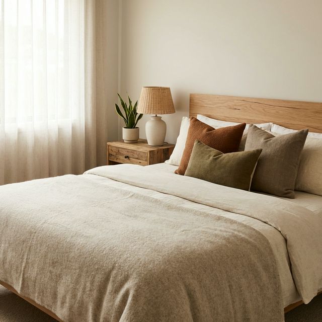
Effect: Calming, lowers heart rate and blood pressure, promotes concentration. Best rooms: Bedrooms, bathrooms, home offices. Caution: Too much cool blue can feel cold and depressing, especially in Canadian winter light. Choose warm blues (blue-green, blue-grey) over icy blues.
For more on this topic, see our guide on The Best Interior Paint Colours for Canadian Homes in 2026.
Green
Effect: Restful, balancing, connected to nature. Green is the colour the human eye processes most easily. Best rooms: Living rooms, bedrooms, home offices, kitchens. Caution: Neon or lime greens are stimulating rather than calming. Stick to muted, natural greens (sage, olive, forest).
For more on this topic, see our guide on Biophilic Design for Cold Climate Homes, Bringing Nature Inside When Winter Won’t End.
Yellow
Effect: Energising, cheerful, stimulates conversation. Best rooms: Kitchens, dining rooms, entryways. Small doses in any room. Caution: Bright yellow in large quantities can cause anxiety. Use as an accent colour, not a wall colour.
Red
Effect: Stimulating, increases heart rate and appetite, creates urgency. Best rooms: Dining rooms (encourages eating and conversation), accent walls. Caution: Red in bedrooms can disrupt sleep. Red in home offices can increase stress.
White
Effect: Clean, spacious, reflective. Best rooms: Any room where maximising light is the priority. Caution: All-white rooms can feel sterile and cold. Warm whites (with yellow or cream undertones) are more livable than cool whites.
Black and Dark Colours
Effect: Dramatic, intimate, sophisticated. Best rooms: Accent walls, powder rooms, dining rooms. Caution: Dark colours absorb light. Use in rooms with good natural or artificial lighting. Small rooms in dark colours can feel either cosy or claustrophobic depending on lighting.
The Practical Rule
Choose calming colours (blue, green, neutral) for rooms where you rest and focus. Choose energising colours (yellow, red, warm tones) for social and active spaces. Use your favourite colour somewhere in your home, regardless of what any guide says.