Kitchen Herringbone Backsplash
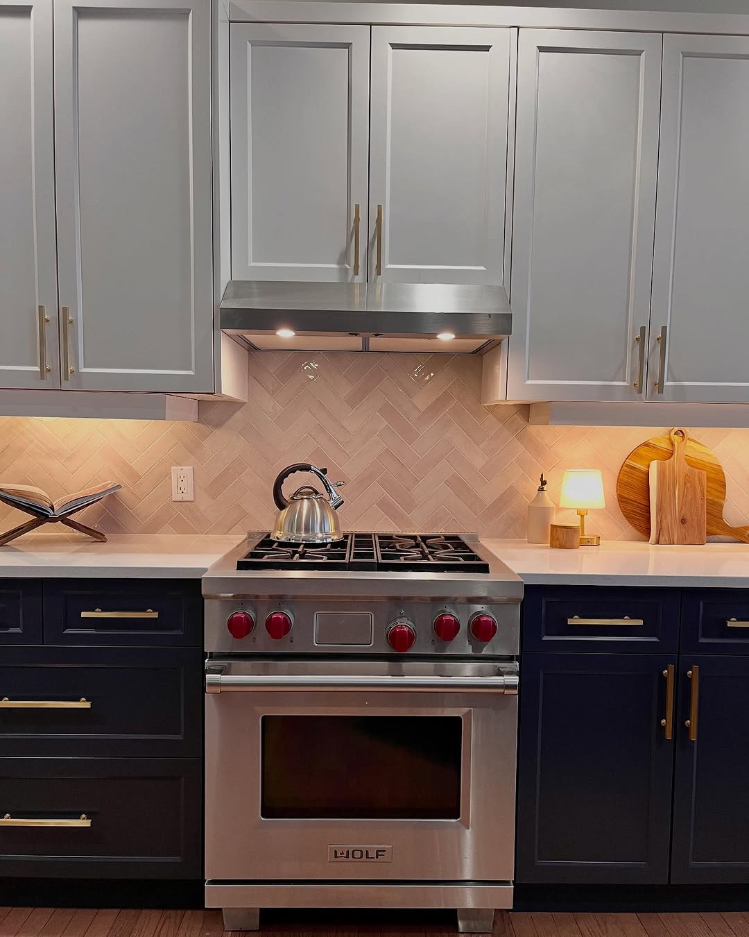
A herringbone backsplash installation that felt natural to the home & supported the overall design. Paired with custom cabinetry by Shray Doors and More.
Georgia
Winnipeg, MB
“It looks fantastic!” — our client’s exact words.
For this kitchen, we selected and installed a herringbone backsplash that felt natural to the home and supported the overall design. Every tile was placed with intention — the pattern adds movement without overwhelming the space.
Custom cabinetry by Shray Doors and More completed the transformation.
Why Herringbone Works in Kitchens
Herringbone is one of those patterns that adds visual interest without competing with everything else in the room. The angled arrangement creates a sense of movement and depth that a standard subway tile layout simply cannot match. It draws the eye without demanding attention, which makes it work alongside both simple shaker cabinetry and more detailed door styles.
The pattern also has a practical advantage: because of the way the tiles interlock at angles, small imperfections in the wall surface are less noticeable than they would be with a straight stack or running bond pattern. That matters in older Winnipeg homes where walls are not always perfectly plumb.
Choosing the Right Tile Size and Colour
For a herringbone backsplash, smaller tiles (2x6 or 3x6 inches) create a tighter, more detailed pattern. Larger tiles (3x12 inches) give a bolder, more contemporary look with fewer grout lines. The choice depends on the scale of your kitchen and how prominent you want the pattern to be.
Neutral colours are the safest choice for a backsplash you will live with for a decade or more. White, off-white, and light grey tiles let the pattern do the talking. If you want something warmer, consider a creamy beige or soft sage — just keep the grout colour close to the tile colour for a cohesive look rather than a contrasting grid.
Grout Matters More Than You Think
One of the most common mistakes homeowners make with herringbone is choosing a grout colour that fights the tile. Dark grout on white tile creates a busy, almost dizzying effect when the pattern is this active. Matching or slightly contrasting grout (white tile with light grey grout, for example) lets the herringbone shape come through cleanly.
Also consider grout width. Tighter grout joints (1/16 inch) give a more refined, custom look. Standard 1/8-inch joints are easier to install and more forgiving, which is worth considering if you are working with a tile setter who has not done many herringbone layouts.
Installation Considerations
Herringbone takes longer to install than a standard layout because every tile needs precise alignment. The cuts at the edges are more complex, and any misalignment early in the pattern gets amplified as it goes. This is not a weekend DIY project for most homeowners. A skilled tile installer will set up guide lines and work from the centre out to keep the pattern symmetrical.
Budget roughly 15 to 20 percent more tile than the measured square footage to account for the angled cuts and waste. This is standard for any diagonal or patterned layout.
The Finished Look
This kitchen came together exactly as planned: the herringbone backsplash adds texture and personality, the custom cabinetry provides clean lines and solid storage, and the overall feel is warm without being fussy. It is a kitchen that looks intentional, because every choice was.
Would you use a herringbone backsplash? Diane did in her own kitchen and would choose it again in a heartbeat.
We evaluate home design ideas and products independently. To learn more about our editorial standards, read our Editorial Policy.