Best Paint Colors for Dark Rooms with Northern Light | Georgia Home Design
How to choose paint colours for rooms with north-facing windows. Warm tones, cool tones, and the shades that work in low light.
Georgia
Best Paint Colors for Dark Rooms with Northern Light
Best Paint Colors for Dark Rooms with Northern Light
North-facing rooms are the most challenging spaces in Canadian homes when it comes to colour. The light that comes through a north window is cool, indirect, and flat — it never gets the warm, golden quality of south-facing light. In Canadian winters, when the sun sits low and daylight hours shrink to eight, north-facing rooms can feel downright gloomy.
The wrong paint colour makes it worse. Cool greys turn blue. Whites look clinical and cold. Beiges go flat and lifeless. I’ve watched homeowners repaint the same room three times because the colour that looked perfect on the sample chip at the store turned into something unrecognizable once it was on the wall.
Here’s how to choose paint colours that actually work in rooms with limited or northern light.
Understanding Northern Light
North-facing windows in the Northern Hemisphere receive no direct sunlight. The light they provide is:
- Consistent — it doesn’t change dramatically throughout the day
- Cool-toned — it has a blue undertone
- Low intensity — it’s softer and dimmer than south, east, or west light
This means every paint colour you apply will be influenced by that cool, blue-grey cast. Colours shift in predictable ways under northern light:
- Whites become cooler and can look blue-grey or sterile
- Cool greys amplify the blue, making rooms feel cold
- Beiges lose warmth and read as flat or muddy
- Greens shift bluer
- Warm tones (yellows, terracottas, warm pinks) hold up much better because they counterbalance the cool light
The Colour Strategies That Work
Strategy 1: Lean Into Warmth
The most reliable approach for north-facing rooms is choosing colours with warm undertones. These counteract the cool light and create a sense of coziness.
Warm whites:
- Benjamin Moore White Dove (OC-17) — a soft, warm white with a hint of yellow. Perfect for trim and walls
- Sherwin-Williams Alabaster (SW 7008) — warm without being yellow
- Benjamin Moore Chantilly Lace (OC-65) — one of the cleanest warm whites, works when you want brightness without coolness
Warm neutrals:
- Benjamin Moore Edgecomb Gray (HC-173) — a warm greige that holds up beautifully in low light
- Sherwin-Williams Accessible Beige (SW 7036) — the name is boring, the colour is excellent. Warm, versatile, and flattering in any light
- Benjamin Moore Revere Pewter (HC-172) — a warm grey with green and beige undertones that prevents it from going cold
Warm accent colours:
- Terracotta and clay tones — rich, earthy, and naturally warm
- Ochre and mustard — bold but grounding, they glow in low light
- Warm blush and dusty rose — softer than pink, they add warmth without feeling juvenile
For more colour guidance, our Choosing a Color Palette Guide covers the fundamentals.
Strategy 2: Go Rich and Dark
This feels counterintuitive — painting a dark room in a dark colour? But it works, and here’s why: a dim room painted white looks like a dim room trying to be bright. A dim room painted in a rich, saturated colour looks intentional, cozy, and sophisticated.
Dark colours that work in north-facing rooms:
- Deep forest green (Benjamin Moore Hunter Green or Sherwin-Williams Rookwood Dark Green)
- Rich navy (Benjamin Moore Hale Navy HC-154)
- Warm charcoal (Benjamin Moore Kendall Charcoal HC-166)
- Deep plum or aubergine
- Chocolate brown
When to use this strategy:
- In rooms you use primarily in the evening (dining rooms, bedrooms, dens)
- In rooms with enough artificial lighting to supplement (you’ll need 3–4 light sources)
- When you want the room to feel intimate rather than bright
When to avoid it:
- In the only living space with northern exposure
- In very small rooms where dark walls feel oppressive
- In kitchens or home offices where task lighting and brightness matter
Strategy 3: Use Yellow-Based Neutrals
Yellow-based colours are the secret weapon for north-facing rooms. Even a subtle yellow undertone catches and amplifies whatever warm light exists.
Options:
- Benjamin Moore Hawthorne Yellow (HC-4) — not bright yellow, but a deep, golden neutral that transforms a dark room
- Sherwin-Williams Anjou Pear (SW 6381) — a warm green-gold that brings life to dim spaces
- Benjamin Moore Pale Oak (OC-20) — a neutral with enough warmth to resist the blue cast of northern light
Colours to Avoid in North-Facing Rooms
Pure cool whites (Benjamin Moore Decorator’s White, Sherwin-Williams Extra White) — they’ll look blue-grey and sterile.
Cool greys (any grey with blue or purple undertones) — the northern light amplifies the coolness until the room feels like an office or a hospital.
Mint green — the blue undertone in northern light pushes it toward an unsettling aqua.
Lavender — turns grey and sad without warm direct light.
Pale blue — becomes icy and clinical. If you want blue, go deep (navy) rather than light.
How to Test Paint Colours Properly
Never choose paint from a chip alone. The small swatch in fluorescent store lighting tells you almost nothing about how the colour will look in your north-facing room.
The proper testing method:
- Buy sample pots ($8–$12 each) of your top 3–4 choices
- Paint a 2x2-foot section on at least two walls (one near the window, one on the opposite wall)
- Observe the samples at three different times: morning, afternoon, and evening with artificial light
- Live with the samples for at least 48 hours before deciding
- Look at the samples in both natural and artificial light — you’ll use the room in both conditions
The white card trick: Paint your samples on separate pieces of white poster board and move them around the room. This lets you compare colours in different light conditions without committing to paint on the wall.
Artificial Lighting Matters as Much as Paint
In a north-facing room, your artificial lighting is on for most of the hours you use the space — especially from October through March. The colour temperature of your bulbs changes how paint looks as much as the natural light does.
Use warm-toned bulbs (2700K) in north-facing rooms. Cool daylight bulbs (5000K) compound the blue-grey cast and make the room feel like a dental office.
Layer your lighting:
- Ambient overhead lighting (recessed or flush-mount)
- Table lamps and floor lamps at multiple heights
- Accent lighting on shelves or art
More light sources at lower individual intensity create a warmer, more flattering atmosphere than one bright overhead fixture. See our complete Lighting Design Guide for detailed strategies.
Room-Specific Recommendations
North-Facing Living Room
Go with a warm white or warm neutral on the walls. Add warmth through textiles — cream throws, camel pillows, warm wood furniture. Layer lighting generously.
North-Facing Bedroom
This is where dark, rich colours shine. A bedroom painted in deep green or warm charcoal with white bedding and brass accents feels like a luxury retreat.
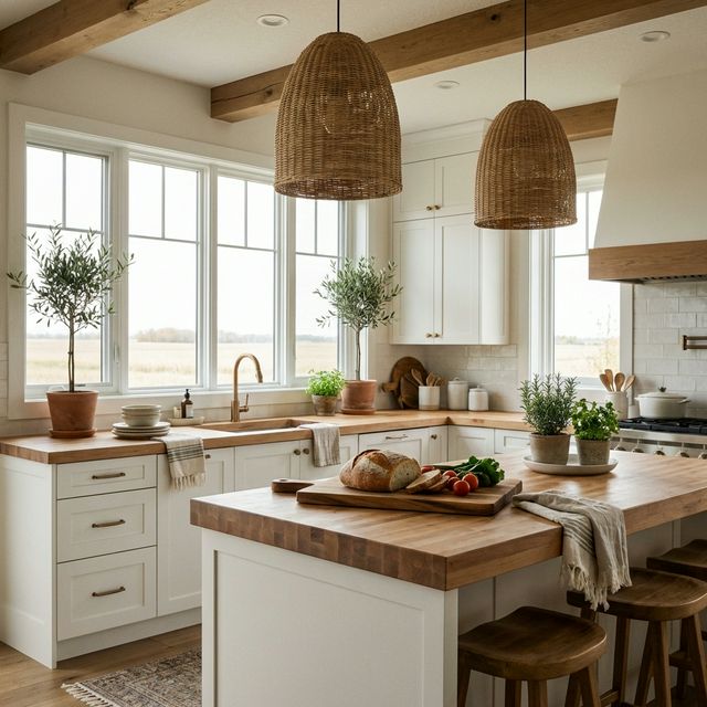
North-Facing Kitchen
Stick with warm whites or very light warm neutrals. Kitchens need to feel bright and clean, and darker colours can make a north-facing kitchen feel cramped. Compensate with under-cabinet lighting and warm-toned pendants.
North-Facing Home Office
Warm whites or warm light neutrals. You need enough brightness for productive work without the sterility of cool tones. Position your desk lamp to supplement the flat northern light.
Our guide on Best Paint Colors for Small Canadian Homes has related advice for compact spaces.
The Finish Matters Too
In low-light rooms, paint finish affects how much light bounces around the space:
- Matte/flat: Absorbs light. Use only on walls where you want a soft, velvety look. Avoid on all surfaces in a dark room
- Eggshell: Reflects a small amount of light. The standard choice for most walls — it adds subtle glow without looking shiny
- Satin: Reflects more light and is easy to clean. Good for trim, doors, and high-traffic areas. In a very dark room, satin walls can help
- Semi-gloss: Use on trim and doors only. Too shiny for walls
Quick Reference
| Situation | Recommended Approach |
|---|---|
| Want brightness | Warm white (White Dove, Alabaster) |
| Want coziness | Rich dark tone (Hale Navy, Hunter Green) |
| Want neutral versatility | Warm greige (Edgecomb Gray, Accessible Beige) |
| Want energy | Yellow-based neutral (Hawthorne Yellow, Pale Oak) |
| Avoid | Cool whites, cool greys, pale blues, lavender |
Struggling with colour in a tricky room? Georgia Home Design offers virtual colour consultations — I’ll look at your space via video, assess the light conditions, and recommend specific colours that will work beautifully. Book a consultation →